For the printmaking project, I chose a prehistoric animal called a 'Chalicothere', here, the Chalicothere is going to eat some berries in a tree, because they were herbivores. The project I feel was crafted well because I carefully planned out where each color was going to go, and made sure to watch where I was carving. When carving, I did my best to make sure there were no extra lines that would show up when printing, though eventually it was inevitable for them to show up. When actually inking the picture, everything was fine with a few, and I was covering all fo it with the right amount of printing paint, but due to some papers drying in an odd way, some have less paint on them. Everything in my painting is supposed to have it's own texture to it, the berries at the top have a rounded shape, and the plains in the grass in the back look like strokes and give it a soft feeling. The colors I chose are very bright and eye popping, I wanted to make the print look somewhat Popart, and I was inspired by a video game called 'Viva Pinata', where the animals have these very bright colors. The colors go from light to dark, Yellow, pink, blue, green, black, and then orange for the background. Each color is easily visible because they are so bright, and no color overshadows another. If I could recreate the pieces, I would go back and choose a dark purple instead of the forest green for the darker colors, and to bold the lines of the shrubbery and fruit in order to make it more obvious that they are indeed shrubbery.
|
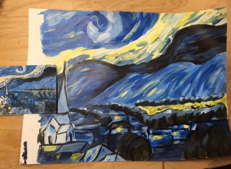
The artist that I chose was Winslow Homer, in my research, I noticed that he usually painted the ocean, nature, realism, and nature/movement. I had tried my best to emulate that in my painting.
I believe my painting is well executed and neat because I spent my time carefully looking back and forth at other Homer paintings. I wasn't able to blend anything as well as I could've because I was using acrylic paint. I used mostly my smaller brushes to paint the small foamy parts of the sea, and I used dark blue and light blue colors. The most difficult part of this project was the water because it was the most time consuming. I had to individually paint dark and light strokes to make the water realistic. The entire painting is mostly a dark blue color, Winslow Homer painted many oceanic scenes of the gulf, they were all dark and stormy ocean paintings. In mine, I decided to do that as wel and make a dark blue/purple stormy ocean scene. I believe that Homer would give me tips on painting water and skies if he saw my painting today, and probably tell me to blend more and use oil paints next time instead of acrylic. If I did this project again, I would have changed the structure on the left to a boat instead, because I feel it is a bit out of place in the stormy painting. I would also use oil paints or watercolor instead of acrylic, even though I did enjoy painting with acrylic. For my sculpture project, I decided to make a crepe with ice cream and fruit. My craftmandship is well because I spent a lot of time making my clay food to look accurate, thought I know I should have seperate the small parts in order to have painted it easier and more efficiently. The most difficult part of the project was sculpting the food, mostly because the crepe was round and in a cone shape, I have to stuff it full of paper towel in order to keep its shape round, and not let it flatten while it dried. I as well did not enjoy getting clay stuck up my fingernails. My color choices worked well together because my ice cream and chocolate crepe were of bland colors, but the fruits were bright and colorful which helped make it stick out. Because my sculpture is a cone ice cream shape, the view it is the most interesting is from the top or front, where you can see the fruits and ice cream. Though the other sides look interesting as well because of the color and shapes. Constructing sculpture was much more difficult than doing 2D Art, mostly because the details must be so specific or else the project will not look realistic. To create textures, I used a small needle tool to make the ripped edges of the ice cream to make it look like it was just scooped, and I pokedholes in the outside of the strawberry to give it seeds. Most of my textures were done with the small needle tool. I believe my sculpture looks like the food because the fruits and ice cream look very realistic, I accomplished this by looking at the food and copying the textures into my clay. I as well arranged the food in a way that the food is arranged in real life. If I did this project again, I would make each part of the project seperately in order to have painted it better, and easier. Many of the parts were hard to reach and left unpainted because so.
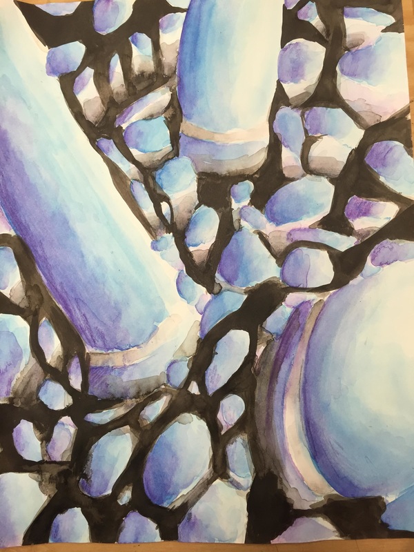 For my Georgia OKeefe project, I chose a sea urchin. This was made with watercolors and india ink. I think the project is neat in a messy way, the art is messy and somewhat abstract, which is purposeful. In that way, it is neat. I think the values work well, the purple I used makes value for the blue. The way I represented the artist OKeefe, was by zooming in on the sea urchin so that it is unclear what the art is of. My choice of colors were mostly blue, purple, white, and black. I went in first with the blue, which was my middle range color. Afterwards, the purple I used shaded the blue to create dimension, wherever I felt it wasn't dark enough, I used a bit of black. The blue and the purple work well together because they are close on the color circle, and they compliment eachother. In my drawing, the dark black contrasts the blue to make the blue pop more, and by attempting to paint in the sear urchin smoothly, the texture of the spines looks smooth, but slightly rough. Wherever the parts were light, I used white watercolor with little water and went over, I as well left parts uncolored. The difficulties I had with this were with using watercolor, though I love it very much. I was frustrated with waiting and hhaving to use a watercolor pencil for the purple. I could've attempted to blend in the purple better, because I still think it looks too rough for something that is of a smooth texture.
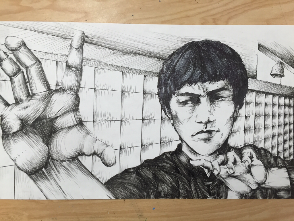 For the perspective project, I decided to draw a picture of Bruce Lee, with his arms elongated to show perspective, as well as a dojo setting in the back. This is my first full art piece done entirely in ink. I'm very proud of it, though I had many problems working on it.
My original idea had him with his arm up towards the sky, but the arm wouldn't fit in the picture because the size of the paper was too small. My pens dried out many times, but I still enjoyed doing this because of how well I think it turned out. I used hatching mostly, I'm not a fan of cross hatching because to me it doesn't look very appealing, I chose to use hatching because I like one contant theme instead of multiple. Texture is important in my composition because it shows the difference between skin wrinkles, and clothes, and hair. Value is important in this project because it shows the perspective of the object, it makes it look more three dimensional. I'm pretty sure I used correct perspective in this drawing, I showed depth by value and shading the things farther away, darker. The mini lessons were helpful as they taught me how to hatch. If I could recreate the piece, I would have used a bigger piece of paper so that I could draw his arm more upward, and make his face more symmetrical. I think that what I learned for this project will help me ink drawings in the future, and how I should shade/add value to said picture. |
AuthorWrite something about yourself. No need to be fancy, just an overview. Archives
May 2016
Categories |
 RSS Feed
